Tag Archives: experiential graphic design

Integrating Environmental Graphic Design into the Architectural Process

Integrating Environmental Graphic Design into the Architectural Process

Meta Title: Integrating Environmental Graphic Design with Architecture
Meta Description: Learn how to incorporate environmental graphic design into the architectural process from concept to construction for seamless, immersive results.


Too often, Environmental Graphic Design (EGD) is treated as an afterthought—layered on after the building is designed, when most impactful decisions have already been made. But the most successful projects integrate EGD from day one, during the concept development phase, right alongside architects, interior designers, and engineers.

At Hi Octane Design, we believe in a truly collaborative process where graphic systems are embedded into the DNA of a space, not just applied to its surface. This early integration ensures that wayfinding, placemaking, and brand storytelling are woven into the built environment with clarity and intention.

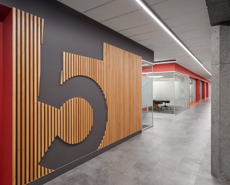
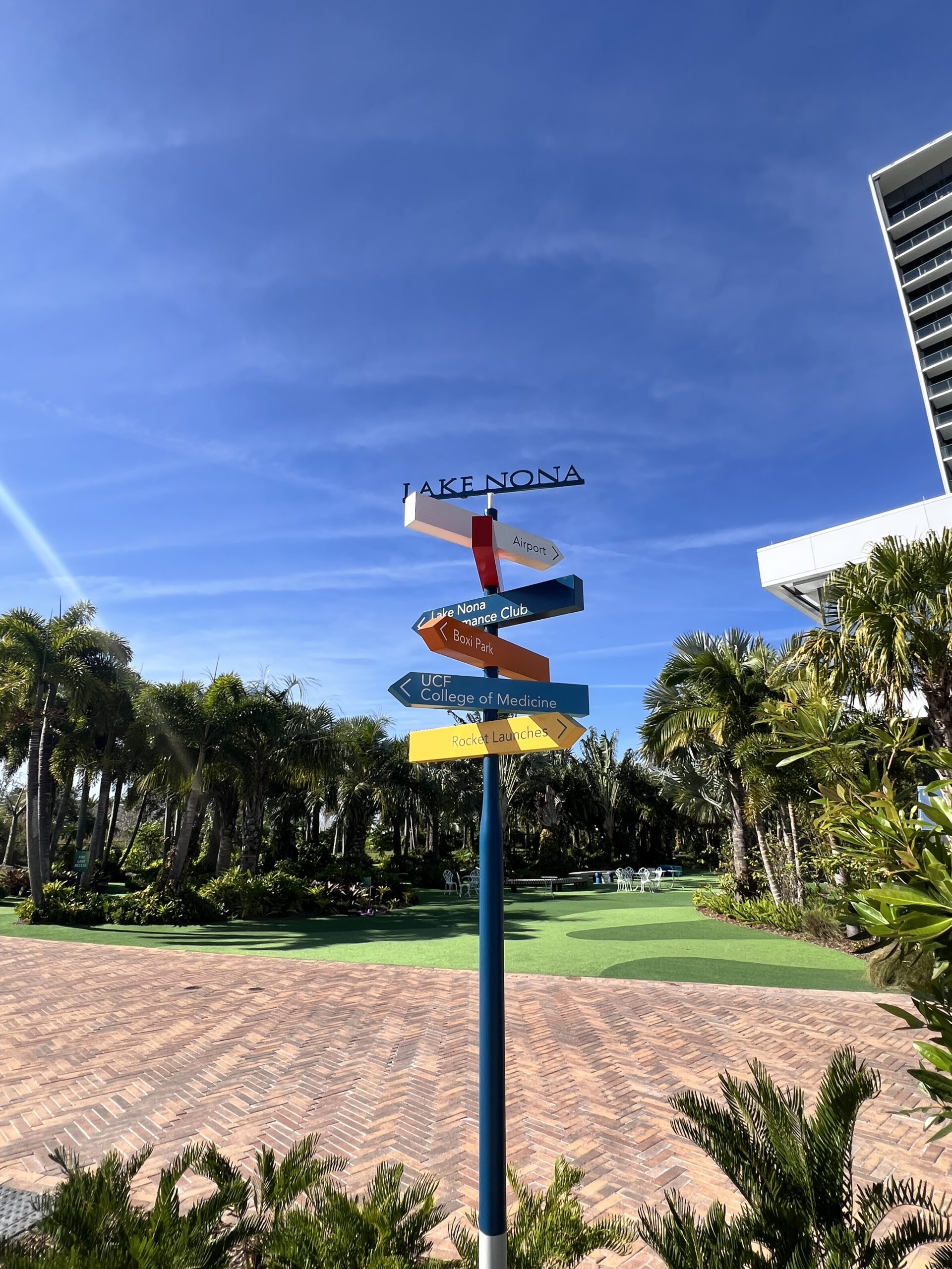
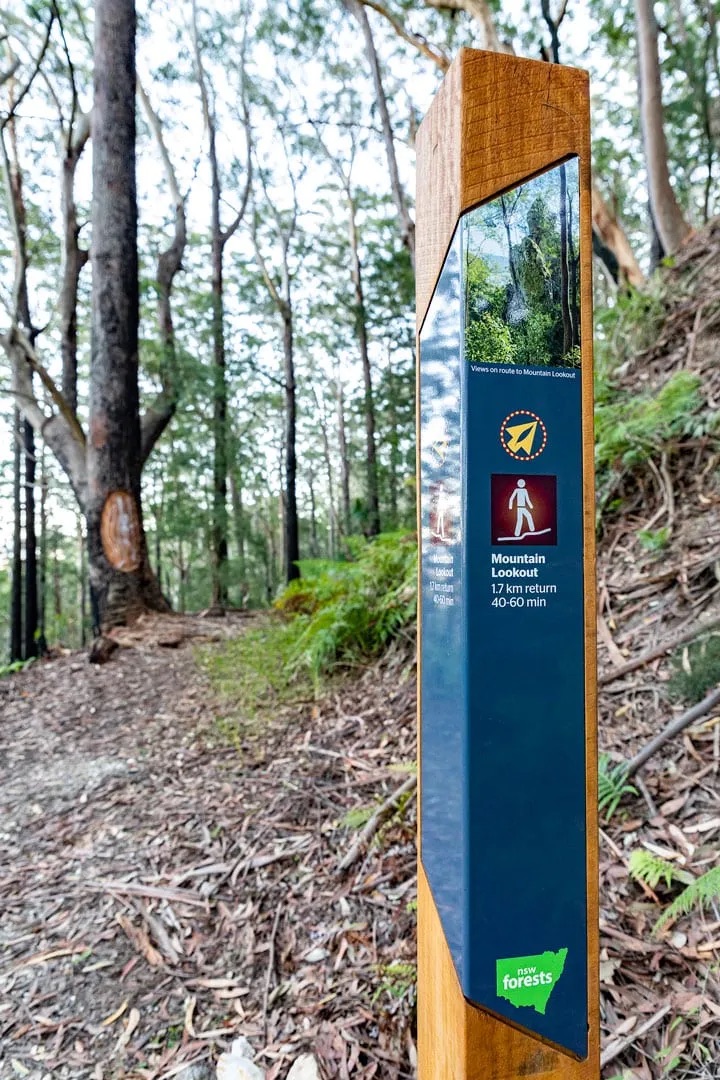
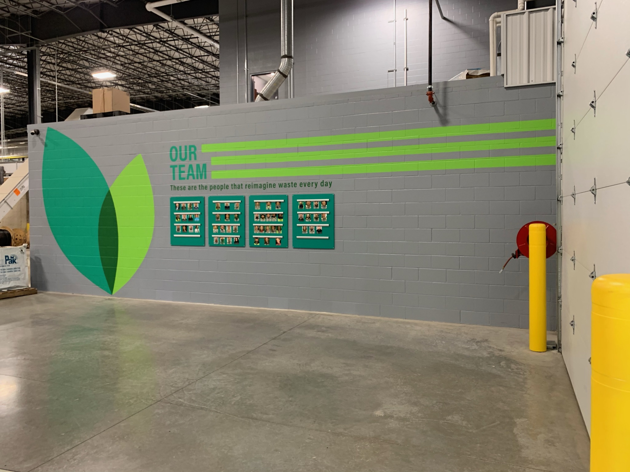
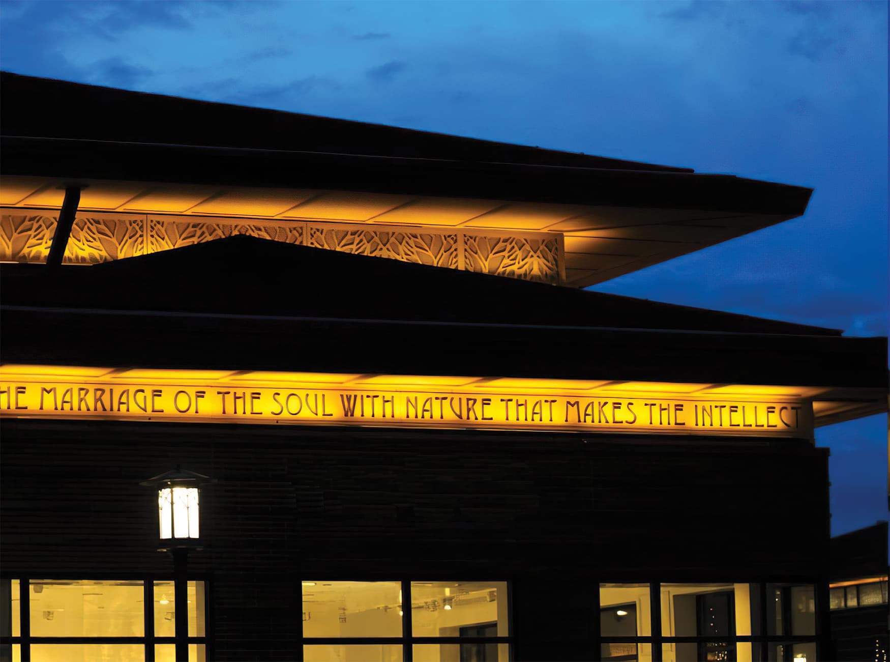
By aligning with architectural sightlines, structural rhythms, and spatial flow, we create graphic experiences that feel native to the space. Signage and branded elements or architectural graphics can be integrated into walls, ceilings, and structural elements—not simply tacked on—and graphic hierarchies can reinforce architectural purpose.

When EGD is brought into the process early, we can also:

  • Specify appropriate materials that support graphic legibility and durability
  • Coordinate lighting, finishes, and surfaces to optimize visibility and visual impact
  • Streamline construction and installation, reducing costly retrofits or change orders
  • Ensure ADA compliance and accessibility are addressed holistically

The SEGD (Society for Experiential Graphic Design) community has long championed this holistic approach, recognizing that integrated EGD leads to more coherent, immersive environments that are both functional and beautiful.

Ultimately, by syncing our workflows with architects and consultants, we not only elevate the user experience—we create built environments that communicate with clarity, purpose, and a strong sense of place.

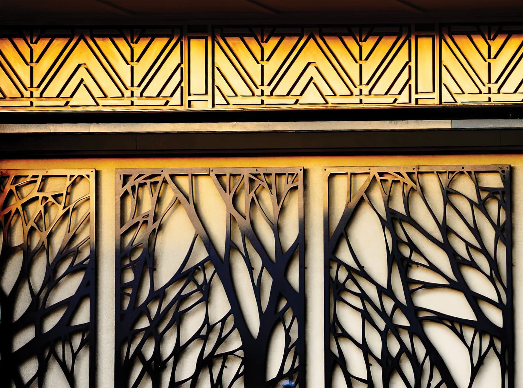
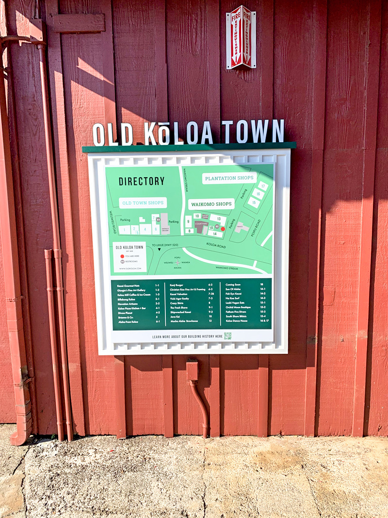
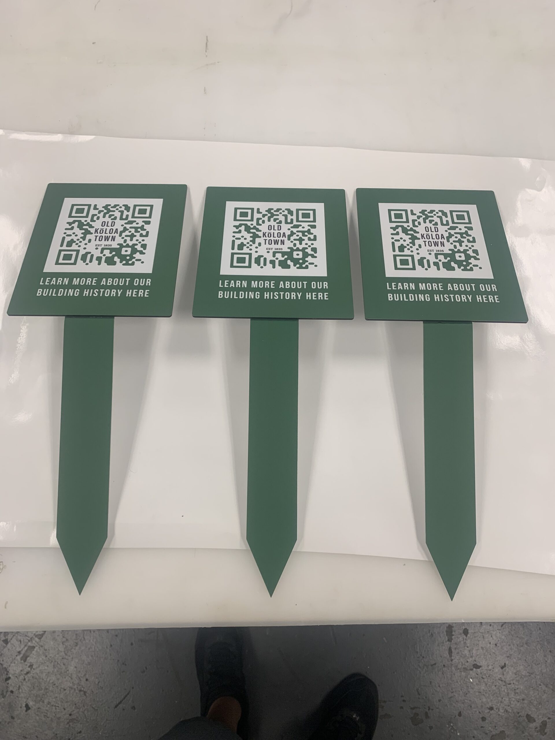
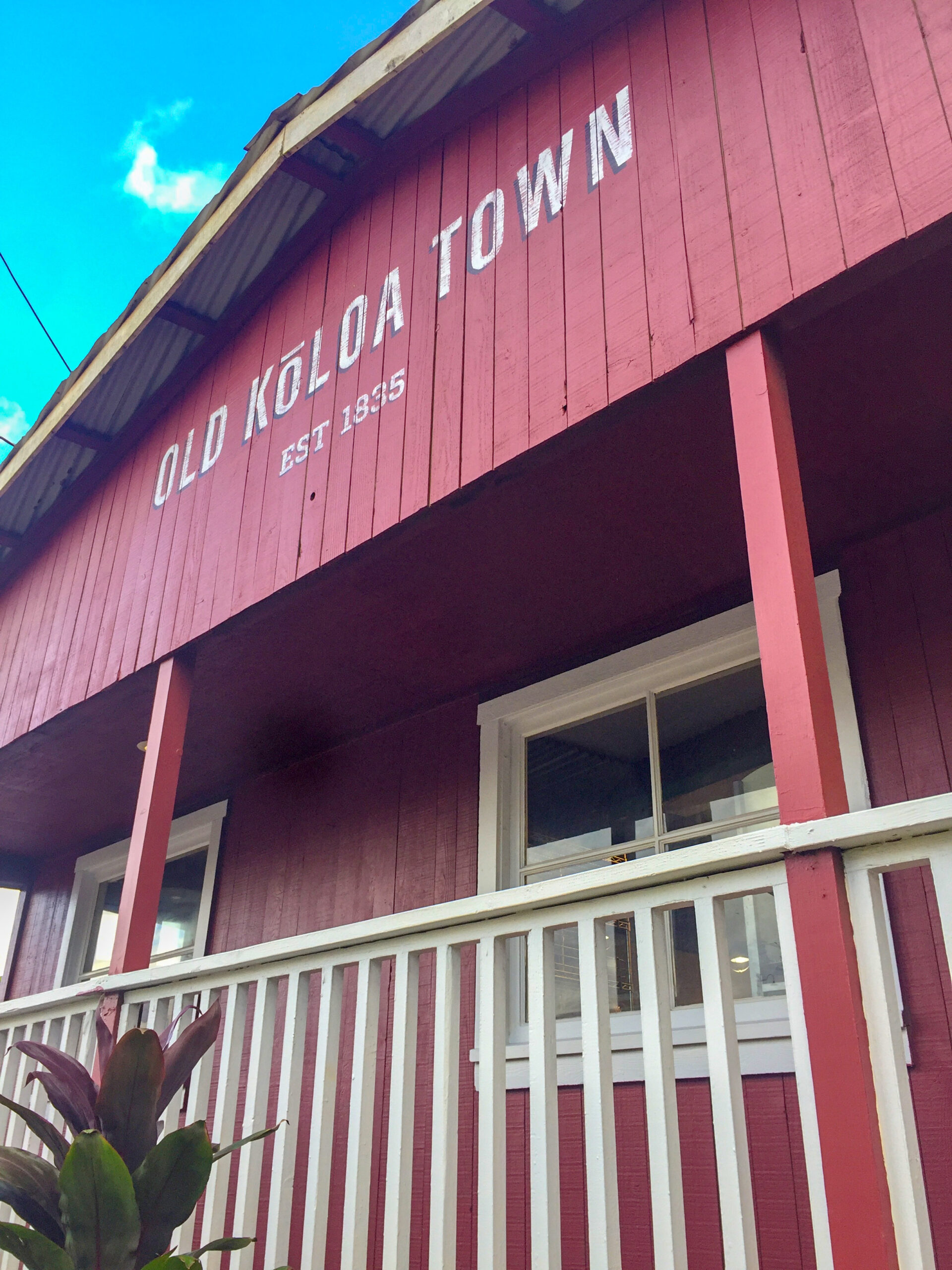
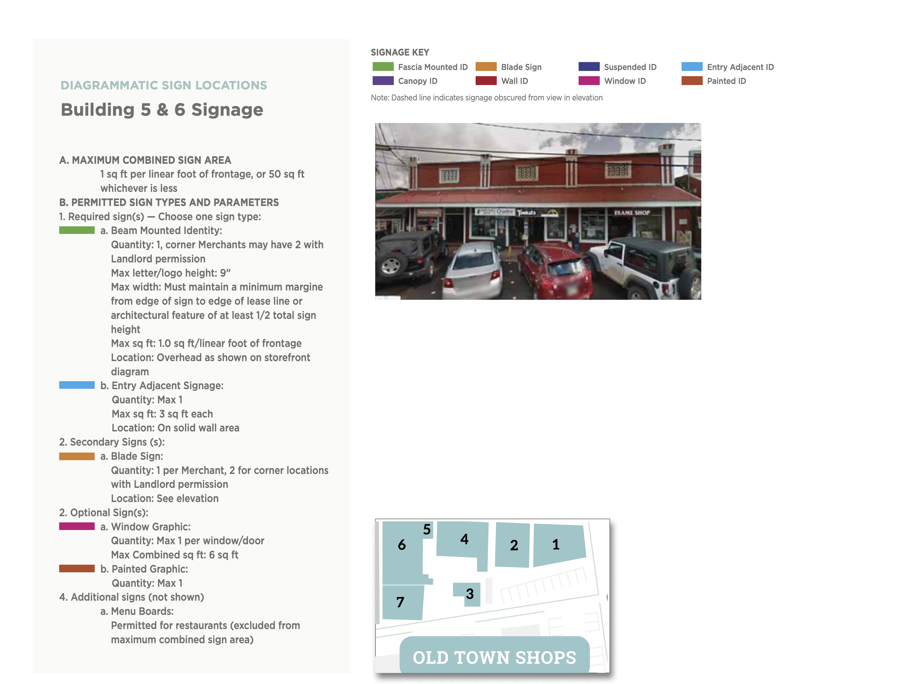
All of these visual examples are real life examples from a project Alicia Hanson was a designer at RSM Design and integrated the elements with the design architects and construction architects on creating elements that seamless integrated with the building architecture.

Designing Wayfinding Systems That Work

Designing Effective Wayfinding Systems | Environmental Graphic Design

Meta Description: Explore the key principles of wayfinding systems in environmental graphic design, and how to create signage that guides and enhances user experience.

As an environmental graphic designer, few challenges are as rewarding as designing a wayfinding system that truly works. These systems do more than point people from A to B—they reduce stress, reinforce branding, and subtly enhance the identity of a place. A well-planned wayfinding program is built from clarity, consistency, and thoughtful placement of signs and graphics, ensuring visitors feel comfortable and oriented wherever they go.

Great wayfinding requires more than good design—it demands a deep understanding of human behavior, spatial dynamics, and accessibility standards. Whether you’re creating navigation for a hospital, campus, or corporate campus, it’s essential to balance aesthetics with function. We also consider how typography, color coding, icons, and material choices can reinforce visual consistency across all touchpoints.

We created QR codes that link to Building History and Directories

To ensure long-term success, wayfinding systems must be adaptable. As facilities grow or change, the signage system should be able to evolve without requiring a full redesign. This flexibility is one of the key topics emphasized by SEGD (Society for Experiential Graphic Design), and one we bring to every wayfinding project. We like to also use the AIGA | DOT symbols for transportation for projects that need to facilitate multiple languages.

Planning a signage system for your campus or facility? Let’s talk about how to make navigation seamless and stress-free. Contact us here

Designing Wayfinding Systems That Work

Meta Title: Designing Effective Wayfinding Systems | Environmental Graphic Design
Meta Description: Explore the key principles of wayfinding systems in environmental graphic design, and how to create signage that guides and enhances user experience.

As an environmental graphic designer, few challenges are as rewarding as designing a wayfinding system that truly works. These systems do more than point people from A to B—they reduce stress, reinforce branding, and subtly enhance the identity of a place. A well-planned wayfinding program is built from clarity, consistency, and thoughtful placement of signs and graphics, ensuring visitors feel comfortable and oriented wherever they go.

Great wayfinding requires more than good design—it demands a deep understanding of human behavior, spatial dynamics, and accessibility standards. Whether you’re creating navigation for a hospital, campus, or corporate campus, it’s essential to balance aesthetics with function. We also consider how typography, color coding, icons, and material choices can reinforce visual consistency across all touchpoints.

To ensure long-term success, wayfinding systems must be adaptable. As facilities grow or change, the signage system should be able to evolve without requiring a full redesign. This flexibility is one of the key topics emphasized by SEGD (Society for Experiential Graphic Design), and one we bring to every wayfinding project.

1. Bold Floor‑and‑Wall Graphics in Corridors A numbered directional system created on walls and floors offers intuitive guidance—strong visual cues tied to spatial zones. Implements clear hierarchy and consistency in placement.

2. Color‑Coded Poles & Fingerposts

Multi-colored arrow posts show different zones or destinations at intersections—highlighting how color and contrast aid quick orientation, and how hierarchical cues guide users .

3. Outdoor Community Path Signage

In parks or campuses, freestanding posts indicate distances, amenities, or safety info (e.g. “rattlesnake warning”). Aesthetically integrated yet adaptable to changing layouts .

4. Functional & Branded Interior Wayfinding

Industrial or corporate interiors use wall-mounted icons, room IDs, and directional arrows with clear typography—showcasing accessibility compliance, readability, and successful branding integration

6 Principles of Effective Wayfinding Systems 🎯

  1. Clear Hierarchy & Organization
    • Different sign types—informational maps, directional arrows, and destination IDs—help shape a logical flow.
  2. Legibility & Accessibility
    • Use of sans-serif fonts, high contrast (70% LRV), Braille, tactile elements ensures universal readability and compliance.
  3. Consistent Visual Language
    • Unified colors, typography, iconography that reflect your brand fosters familiarity and trust.
  4. Strategic Placement at Decision Points
    • Signs installed at junctions, stairs, intersections—minimizing clues overload while maximizing clarity.
  5. Color Coding & Symbol Systems
    • Use of distinct color zones or pictograms lets users navigate by intuitive visual logic, beyond language limitations.
  6. Adaptability & Modular Design
    • A system designed for future expansion—using modular units or digital updates—keeps spaces navigable even when layouts shift.

Symbol Signs: A Universal Communication Tool

International Symbol Signs: A Universal Communication Tool

Symbol signs are a system of 50 pictograms designed to communicate information to passengers and pedestrians in airports, transportation hubs, and other large international venues. They were developed by the American Institute of Graphic Arts (AIGA) in collaboration with the U.S. Department of Transportation (DOT) in the 1970s.

International Symbol signs are designed to be universally understood, regardless of language or culture. They use simple, geometric shapes and clear colors to convey information about essential services and facilities, such as restrooms, baggage claim, and emergency exits.

The symbols are also designed to be highly visible and legible from a distance. They are often used on signs and maps in airports and other busy transportation facilities, where people are often moving quickly and may not have time to read text.

Symbol signs have become a standard feature of transportation facilities around the world. They are also used in other public places, such as museums, stadiums, and shopping malls.

Benefits ofsymbol signs:

  • Universal communication:  symbol signs can be understood by people of all languages and cultures.
  • Clear and concise: The symbols are simple and easy to understand, even from a distance.
  • Highly visible: The bright colors and bold shapes of the symbols make them easy to see in busy environments.
  • Versatile: symbol signs can be used to convey a wide range of information, from essential services to directional cues.

How to use International symbol signs:

When using symbol signs, it is important to consider the following guidelines:

  • Use the symbols in a consistent way throughout your signage system.
  • Place the symbols in a prominent location where they can easily be seen by pedestrians and travelers.
  • Use clear and concise text to supplement the symbols, but avoid cluttering the signs.
  • Make sure the symbols are large enough to be legible from a distance.

Conclusion

Pictograms or symbol signs are a valuable tool for communicating information to people from all walks of life. By using these symbols in a clear and consistent way, you can help to create a more welcoming and accessible environment for everyone.

Download the Symbols