Tag Archives: EGD

The Psychology of Place: EGD’s Impact on Emotions

Meta Title: How EGD Influences Emotions and User Experience
Meta Description: Discover how environmental graphic design shapes emotional responses and strengthens place-based connections through visual storytelling and spatial design.

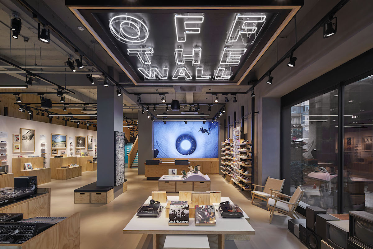
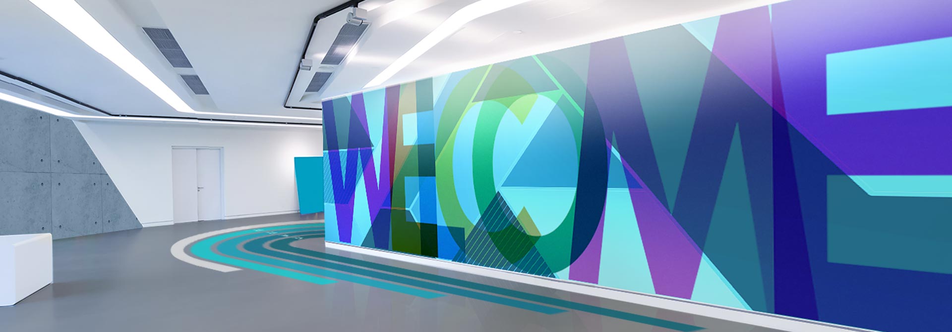
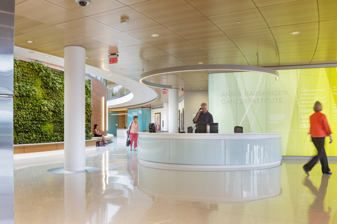
Environmental graphic design is more than decoration—it’s about shaping how people feel in a space. From calming hospital graphics to exciting branded environments in retail, every choice we make as designers has emotional impact. Color, texture, lighting, typography, and storytelling all influence the experience and perception of place.

We draw on psychology to inform our work, using biophilic design principles, sensory cues, and even scent to create environments that feel good to be in. For example, studies have shown that cool colors in healthcare can lower anxiety levels, while warm palettes in commercial spaces can boost energy and engagement. EGD allows us to tap into these responses deliberately.

Biophilic design is an architectural and interior design approach that aims to connect people more closely with nature in the built environment. It incorporates elements of the natural world, such as light, air, plants, and natural materials, to create spaces that promote well-being, reduce stress, and enhance cognitive function and creativity. 

Key aspects of biophilic design:

Direct nature:
This involves incorporating real, sensory experiences of nature, like natural light, ventilation, plants, water features, and views of the outdoors. 

Indirect nature:
This involves using natural materials, colors, textures, and patterns that evoke a sense of nature, even without direct physical presence. 

Human spatial response:
This refers to creating spaces that mimic natural environments, providing a sense of prospect (being able to see what’s coming), refuge (a safe and enclosed space), and mystery. 

Benefits of biophilic design:

Improved health and well-being:
Biophilic design can reduce stress, improve mood, increase creativity, and promote healing. 

Increased productivity:
Studies have shown that exposure to nature can enhance cognitive function and focus, leading to greater productivity in workplaces. 

Enhanced connection to nature:
Biophilic design fosters a sense of connection to the natural world, which is important for both physical and mental well-being, according to some researchers. 

Environmental benefits:
Biophilic design can also contribute to sustainability by promoting the use of natural materials, reducing energy consumption, and increasing biodiversity. 

Examples of biophilic design elements:
Plants and greenery:
Adding indoor plants, green walls, or even small gardens to interior spaces. 

Natural light and ventilation:
Maximizing daylight and fresh air through windows, skylights, and operable windows. 

Natural materials:
Using wood, stone, bamboo, and other natural materials in construction and furnishings. 

Water features:
Incorporating fountains, water walls, or even small ponds to create a sense of tranquility and calm. 

Nature-inspired patterns and shapes:
Using fractal patterns, curves, and other natural forms in design elements. 

Views of nature:
Ensuring that spaces offer views of natural landscapes or incorporate natural elements into the design.

By aligning emotion with brand and function, we create spaces that are not only memorable but meaningful. As SEGD members, we stay current with research and tools that help measure this impact—from user feedback loops to observational studies that validate the power of design in shaping emotional landscapes.

biophilic Space
Ann B Barshinger Cancer Institute, Location: Lancaster PA, Architect: Ballinger

Phase I of the Universal Symbols for Health Care (USHC) research, completed in 2006, confirmed that symbols improve wayfinding by making signage easier to understand than text-only signs. This led to the creation of 28 universal health care symbols for facility navigation.

Recognizing the need for a scalable, universally adopted symbol set, a university consortium was formed in 2008 to guide the development of additional symbols. Following comprehensive testing, 22 new symbols were added, expanding the USHC set to 50 symbols.

Download a PDF of the full set of Universal Symbols for Healthcare for use in your projects. File can be opened in Illustrator for vector art usage. https://cdn.segd.org/wp-content/uploads/2024/12/14_SEGD_Universal-Symbols-for-Healthcare.pdf

Branded Environments vs. Environmental Graphics: What’s the Difference?

Branded Environments vs Environmental Graphics Explained

Clarify the difference between branded environments and environmental graphic design. Discover how each influences spatial identity and user experience.

The terms “branded environments” and “environmental graphics” are often used interchangeably—but they’re not the same. Branded environments are immersive experiences where a brand’s identity permeates the entire space. Environmental graphics, meanwhile, focus on specific interventions like signage, murals, or visual cues.

Think of branded environments as a full theatrical production—the architecture, lighting, materials, and graphics all contribute to a unified story. EGD can be part of this, but it may also serve purely functional or wayfinding purposes without deep brand integration.

Understanding this distinction helps clients invest smartly. Some projects need immersive storytelling; others need strategic graphics that enhance usability. As designers, we help tailor the right approach for each space.

1. Branded Environment (Immersive, Full‑Space Experience)

Above, the first image showcases a retail flagship that blends architecture, lighting, materials, interactive displays, and graphic elements into a cohesive storytelling environment. Every detail—from the seating areas to the product zones—builds the brand’s narrative and emotional connection with the visitor . This is a prime example of a branded environment: immersive, multi-sensory, and deeply integrated.

2. Environmental Graphic Design (EGD) – Functional & Visual Cues

The second image features bold wall graphics, clear signage, and wayfinding elements layered onto the space. The visuals enhance navigation, mood, and aesthetics—without overhauling the architecture or full sensory experience, That’s environmental graphic design: strategic, focused, and highly functional.

Why It Matters

TypeFocusBest For
Branded EnvironmentsMulti‑sensory immersion (storytelling, atmosphere)Flagship stores, pop‑ups, experiential exhibits — spaces needing emotional impact
Environmental GraphicsFunctional wayfinding, brand aesthetics, signageOffices, hospitals, museums, retail layouts — spaces needing clarity and visual polish

Ready to Amplify Your Space?
Whether you need immersive brand storytelling or sharp, strategic graphic interventions, Hi Octane Design delivers high-impact design solutions that bring your environment to life. Let’s create spaces that speak, guide, and inspire.

Harnessing Storytelling in Environmental Graphic Design

Certainty, Variety & Delight: The Three Pillars of EGD

In Environmental Graphic Design, emotion isn’t an afterthought—it’s the engine. Spaces aren’t just seen or used—they’re experienced as stories in motion. Each element—from material and typeface to sightline and scale—is a narrative choice. The three emotional pillars of certainty, variety, and delight form the framework that makes these stories feel alive.

🧭 Certainty – The Opening Scene Certainty is your story’s set — the establishing shot that visually anchors the user. Through clear wayfinding, consistent iconography, sightline clarity, and visual cues, we eliminate confusion and foster confidence. Just like a strong opening scene in Star Wars the spark of I am here on Tattoine certainty says: you’re in the right place, and you’re safe to continue.

🎨 Variety – The Plot Twist Variety is where the story keeps its grip. In EGD, variety does the same through scale shifts, bold materials, texture plays, and color sparks. It transforms the user from passive traveler to curious explorer. Each new sensory beat acts like the next episode—you can’t wait to see what comes next.

✨ Delight – The Emotional Payoff Delight is the big emotional beat—the plot twist that makes you feel. It might be the sparkle of light on a custom mural, an engraved quote revealing itself on a bench, or an interactive feature that encourages a smile. These are purposeful moments that create emotional resonance and cultivate memory. Travis builds experiences where guests “feel slightly uncomfortable—in the best way possible” , inviting them into a story that transcends the ordinary.

🎬 Story-Driven Places When certainty, variety, and delight are choreographed like acts in a story, EGD becomes immersive narrative. Users don’t just traverse space—they live through a designed script. They’re grounded, then intrigued, and finally emotionally moved. Travis Chambers’ Outpost X model is proof: “a really good storyteller on-site shooting only on iPhone in reels format… hooks you into characters and story”. The same narrative techniques are at play in successful EGD.

By weaving these three pillars with storytelling intent, designs do more than convey information—they connect. They turn visits into experiences, signs into scenes, and buildings into storybooks.

EGD doesn’t just direct—it transforms.

Here’s a detailed comparison of an experience at Star Wars: Galaxy’s Edge at Disneyland or Disney World) and Meow Wolf Denver (Convergence Station) — both immersive environments, but with very different approaches to storytelling, design, and emotional engagement:

🎥 Star Wars: Galaxy’s Edge

An immersive cinematic environment built on franchise mythology

1. Story Format:

Galaxy’s drops you inside a story world you already know — the Star Wars universe. It’s a linear, branded narrative. You’re a visitor to the Black Spire Outpost on Batuu, caught in the tension between the Resistance and the First Order. You don’t create the story—you step into a pre-written scene.

2. Emotional Arc:

  • Certainty: High — Disney is masterful at using signage, costuming, lighting, and spatial design to orient you without breaking the story.
  • Variety: Balanced — Changes in texture, material, and layout simulate a bustling marketplace, rebel hideouts, or galactic hangars.
  • Delight: Intense — From building your own lightsaber to flying the Millennium Falcon, the emotional highs are designed to deliver awe and nostalgia.

3. Design Language:

  • Hyper-detailed, realistic, cinematic
  • Texture-rich and weathered, evoking sci-fi frontier worlds
  • Soundscapes, cast interactions, and ambient storytelling immerse you in a believable film set.

4. Role of the Visitor:

You’re a participant, but within scripted bounds. You cosplay, you barter, but you’re part of their world, not creating your own.


🎨 Meow Wolf Denver (Convergence Station)

An immersive, multidimensional art installation built around speculative fiction

1. Story Format:

Convergence Station is a non-linear, co-created narrative. You explore fractured realms (like the neon-bright C Street or cathedral-like Numina) in a story about memory, loss, and identity across parallel worlds. It’s abstract, fragmented, and meant to be discovered—not explained.

2. Emotional Arc:

  • Certainty: Low — That’s the point. You’re often disoriented, encouraged to explore without a map or clear goal.
  • Variety: Extreme — Every room shifts your perception: from sci-fi to surreal to organic. Unexpected scale and interactive objects fuel curiosity.
  • Delight: Spontaneous — Delight here comes from discovery: a hidden door, a musical wall, or an actor whispering a clue. It’s designed to evoke wonder and mystery.

3. Design Language:

  • Maximalist, layered, often psychedelic
  • Combines analog, digital, sculptural, and interactive art
  • Dense, surreal environments challenge the senses

4. Role of the Visitor:

You are a detective, explorer, and co-creator. Your path is your own. You might even find pieces of narrative others miss entirely.


🧠 Comparison Summary:

ElementOutpost X (Galaxy’s Edge)Meow Wolf Denver (Convergence Station)
Story ControlPre-written, brandedOpen-ended, co-created
Design FeelCinematic, controlledArtistic, chaotic
NavigationEasy, linearDisorienting, exploratory
Emotional ToneEpic, nostalgicSurreal, thought-provoking
Audience RoleParticipant in a filmExplorer of a multiverse

🧩 Final Thought:

  • Outpost X offers the perfect story you already know, polished to cinematic perfection.
  • Meow Wolf offers a story you have to uncover, layered in symbolism, memory, and sensory tension.

Both are unforgettable. But if Outpost X is Star Wars as theme park opera, Meow Wolf is a lucid dream in 4D.

Symbol Signs: A Universal Communication Tool

International Symbol Signs: A Universal Communication Tool

Symbol signs are a system of 50 pictograms designed to communicate information to passengers and pedestrians in airports, transportation hubs, and other large international venues. They were developed by the American Institute of Graphic Arts (AIGA) in collaboration with the U.S. Department of Transportation (DOT) in the 1970s.

International Symbol signs are designed to be universally understood, regardless of language or culture. They use simple, geometric shapes and clear colors to convey information about essential services and facilities, such as restrooms, baggage claim, and emergency exits.

The symbols are also designed to be highly visible and legible from a distance. They are often used on signs and maps in airports and other busy transportation facilities, where people are often moving quickly and may not have time to read text.

Symbol signs have become a standard feature of transportation facilities around the world. They are also used in other public places, such as museums, stadiums, and shopping malls.

Benefits ofsymbol signs:

  • Universal communication:  symbol signs can be understood by people of all languages and cultures.
  • Clear and concise: The symbols are simple and easy to understand, even from a distance.
  • Highly visible: The bright colors and bold shapes of the symbols make them easy to see in busy environments.
  • Versatile: symbol signs can be used to convey a wide range of information, from essential services to directional cues.

How to use International symbol signs:

When using symbol signs, it is important to consider the following guidelines:

  • Use the symbols in a consistent way throughout your signage system.
  • Place the symbols in a prominent location where they can easily be seen by pedestrians and travelers.
  • Use clear and concise text to supplement the symbols, but avoid cluttering the signs.
  • Make sure the symbols are large enough to be legible from a distance.

Conclusion

Pictograms or symbol signs are a valuable tool for communicating information to people from all walks of life. By using these symbols in a clear and consistent way, you can help to create a more welcoming and accessible environment for everyone.

Download the Symbols