
Meta Title: Designing Effective Wayfinding Systems | Environmental Graphic Design
Meta Description: Explore the key principles of wayfinding systems in environmental graphic design, and how to create signage that guides and enhances user experience.
As an environmental graphic designer, few challenges are as rewarding as designing a wayfinding system that truly works. These systems do more than point people from A to B—they reduce stress, reinforce branding, and subtly enhance the identity of a place. A well-planned wayfinding program is built from clarity, consistency, and thoughtful placement of signs and graphics, ensuring visitors feel comfortable and oriented wherever they go.
Great wayfinding requires more than good design—it demands a deep understanding of human behavior, spatial dynamics, and accessibility standards. Whether you’re creating navigation for a hospital, campus, or corporate campus, it’s essential to balance aesthetics with function. We also consider how typography, color coding, icons, and material choices can reinforce visual consistency across all touchpoints.
To ensure long-term success, wayfinding systems must be adaptable. As facilities grow or change, the signage system should be able to evolve without requiring a full redesign. This flexibility is one of the key topics emphasized by SEGD (Society for Experiential Graphic Design), and one we bring to every wayfinding project.
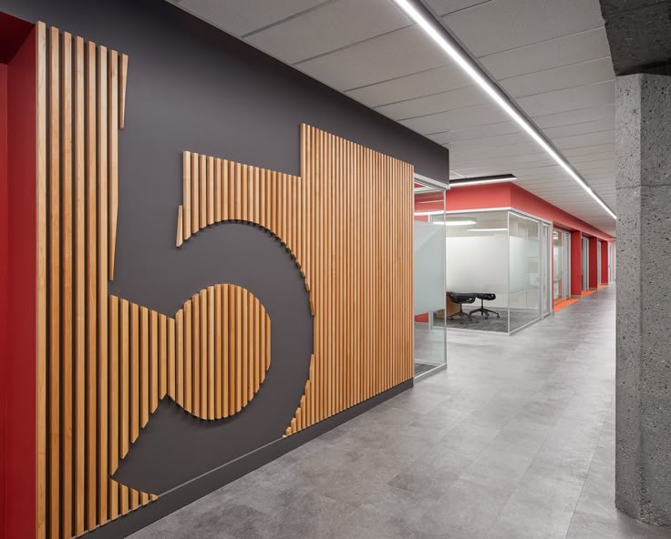
1. Bold Floor‑and‑Wall Graphics in Corridors A numbered directional system created on walls and floors offers intuitive guidance—strong visual cues tied to spatial zones. Implements clear hierarchy and consistency in placement.
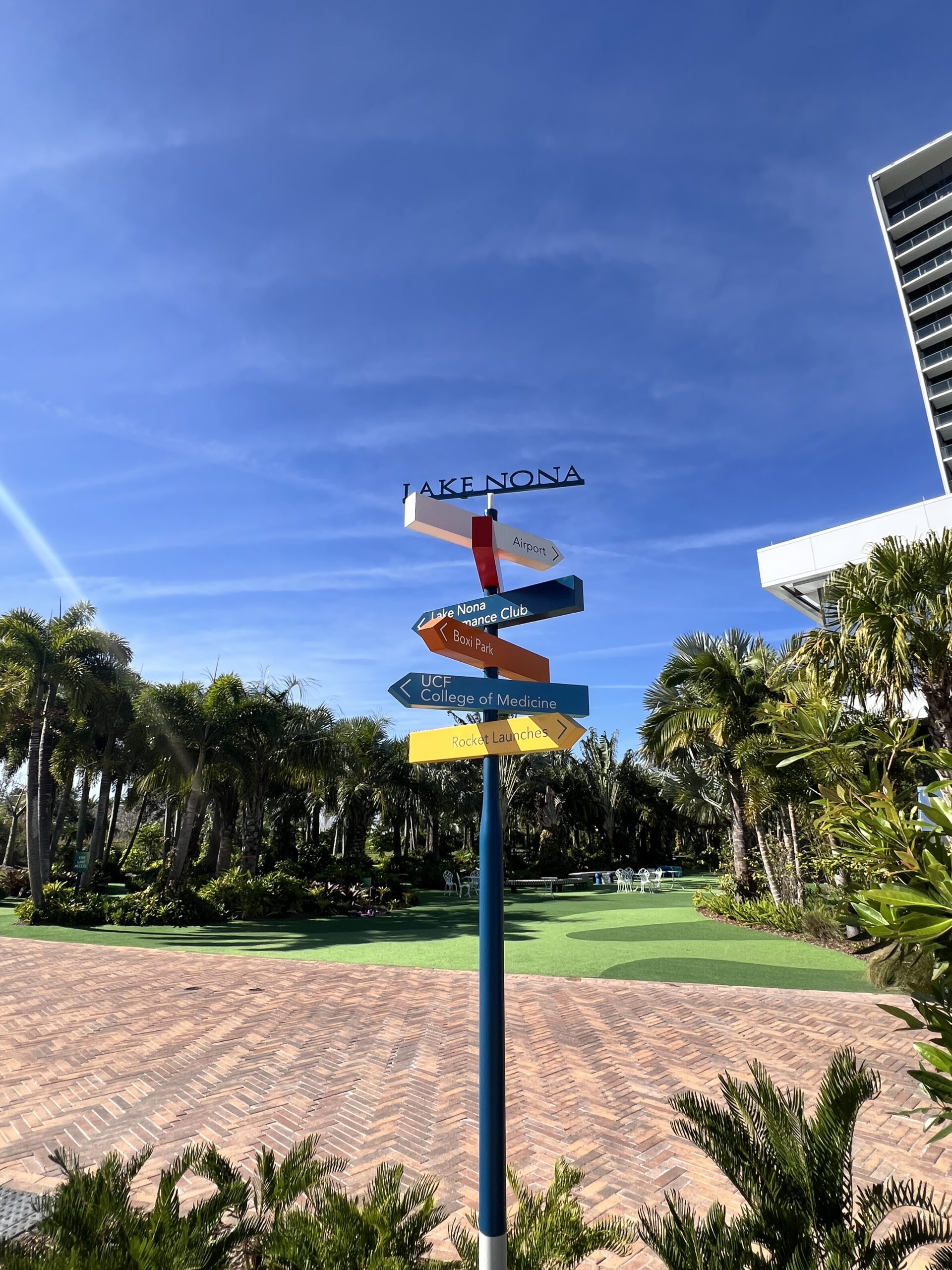
2. Color‑Coded Poles & Fingerposts
Multi-colored arrow posts show different zones or destinations at intersections—highlighting how color and contrast aid quick orientation, and how hierarchical cues guide users .
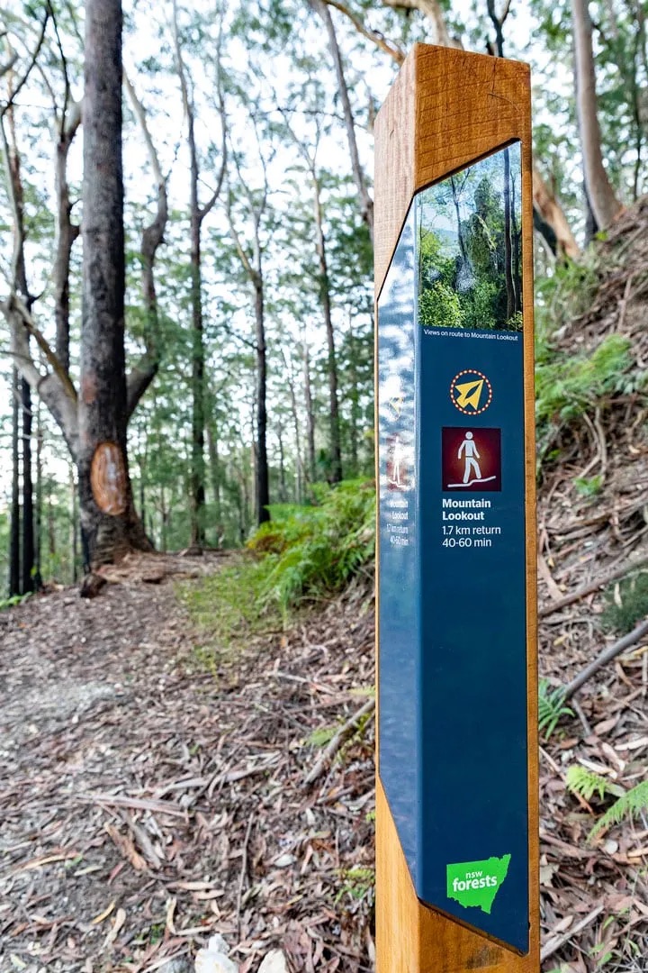
3. Outdoor Community Path Signage
In parks or campuses, freestanding posts indicate distances, amenities, or safety info (e.g. “rattlesnake warning”). Aesthetically integrated yet adaptable to changing layouts .
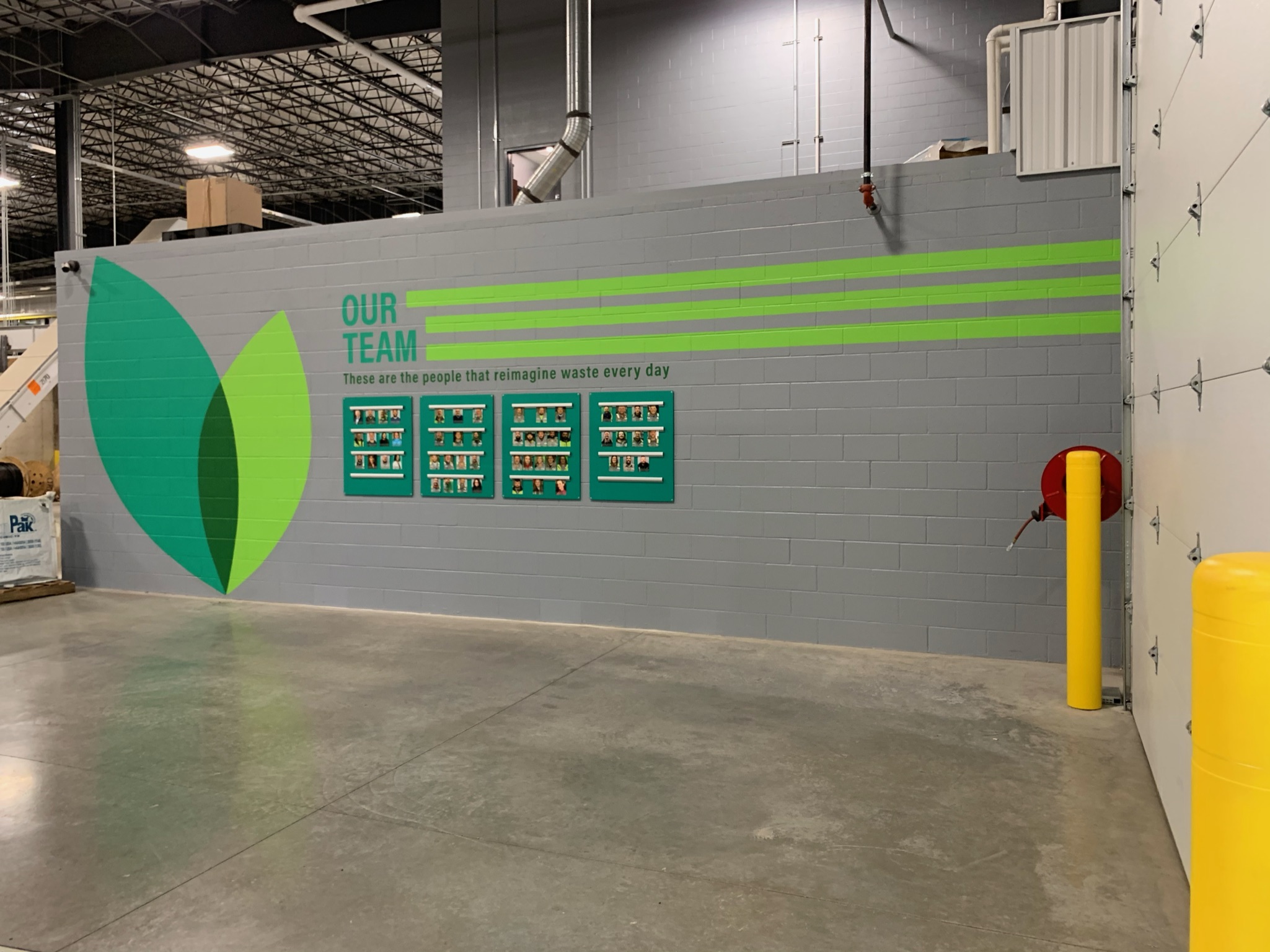
4. Functional & Branded Interior Wayfinding
Industrial or corporate interiors use wall-mounted icons, room IDs, and directional arrows with clear typography—showcasing accessibility compliance, readability, and successful branding integration
6 Principles of Effective Wayfinding Systems 🎯
- Clear Hierarchy & Organization
- Different sign types—informational maps, directional arrows, and destination IDs—help shape a logical flow.
- Legibility & Accessibility
- Use of sans-serif fonts, high contrast (70% LRV), Braille, tactile elements ensures universal readability and compliance.
- Consistent Visual Language
- Unified colors, typography, iconography that reflect your brand fosters familiarity and trust.
- Strategic Placement at Decision Points
- Signs installed at junctions, stairs, intersections—minimizing clues overload while maximizing clarity.
- Color Coding & Symbol Systems
- Use of distinct color zones or pictograms lets users navigate by intuitive visual logic, beyond language limitations.
- Adaptability & Modular Design
- A system designed for future expansion—using modular units or digital updates—keeps spaces navigable even when layouts shift.