In today’s fast-paced, digitally saturated world, designers are increasingly turning to biophilic and biomorphic design principles to reconnect people with the natural world. While biophilic design emphasizes incorporating elements of nature into the built environment—like natural light, water, and plant life—biomorphic design focuses on shapes and forms that mimic natural patterns, such as fractals, spirals, or cellular structures. Together, they create spaces that are not only beautiful but also support mental wellness, productivity, and human comfort.
Architectural examples of these approaches are emerging in innovative ways. The Eden Project in the UK, for example, features massive geodesic biodomes shaped like honeycomb cells that reflect biomorphic forms while housing rich biophilic content—lush vegetation and diverse ecosystems. Likewise, Singapore’s Changi Jewel Airport is a biophilic marvel, where the world’s tallest indoor waterfall flows beneath a canopy of glass and steel, creating a sensory experience that’s deeply calming and energizing. These spaces prove that buildings can do more than function—they can soothe, heal, and inspire.
In interior design, biophilic concepts are evident in projects like Amazon’s Spheres in Seattle, where employees work amidst 40,000 plants in domed glass structures. Natural materials like wood, stone, and living walls dominate the space, while biomorphic furnishings with curving, organic forms soften the workplace experience. Residential designers also use patterns found in nature—think leaf-shaped light fixtures or wave-like room dividers—to mirror the serenity of the outdoors, even in compact urban apartments.
Biophilic design also plays a critical role in environmental graphic design (EGD) and experiential spaces. Consider how Meow Wolf’s immersive exhibits use biomorphic tunnels, textures, and lighting to evoke exploration and organic wonder. On a more functional level, hospitals and clinics have begun integrating biophilic cues—like plant-inspired wayfinding graphics and floor patterns modeled after tree canopies—to reduce patient stress. These visual and spatial experiences extend beyond aesthetics; they ground users in the environment and create a subconscious sense of ease and orientation.
As climate anxiety rises and the value of mental wellness in public and commercial design becomes clearer, the future of built environments will likely depend on these principles. Designers are no longer asking if nature should be included, but how deeply it can be woven into the identity of a space. Biophilic and biomorphic design together, invite us to step into a world that doesn’t separate us from nature, but welcomes us back into its embrace—with every curve, leaf, and ray of light.
Meta Title: Designing Effective Wayfinding Systems | Environmental Graphic Design Meta Description: Explore the key principles of wayfinding systems in environmental graphic design, and how to create signage that guides and enhances user experience.
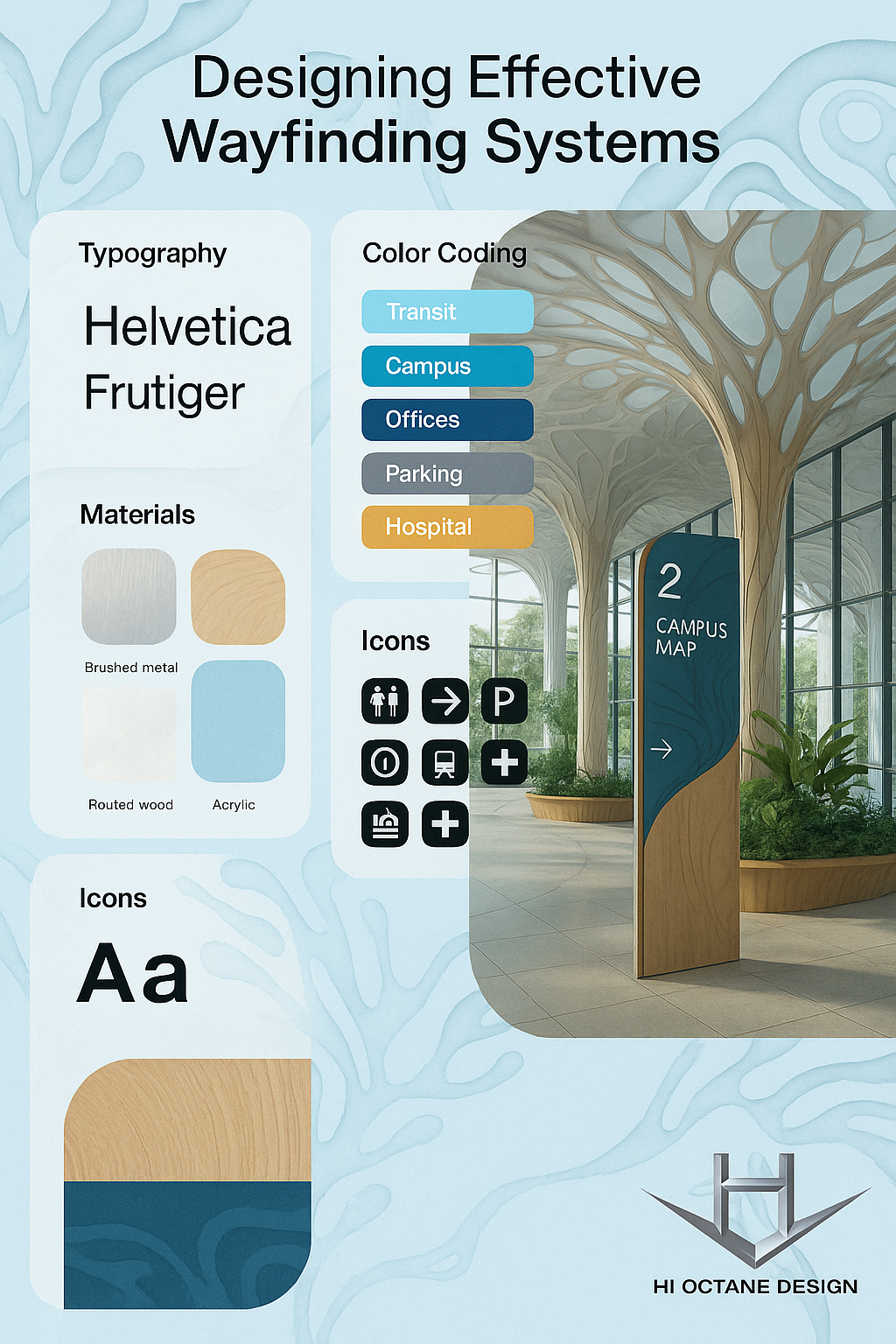
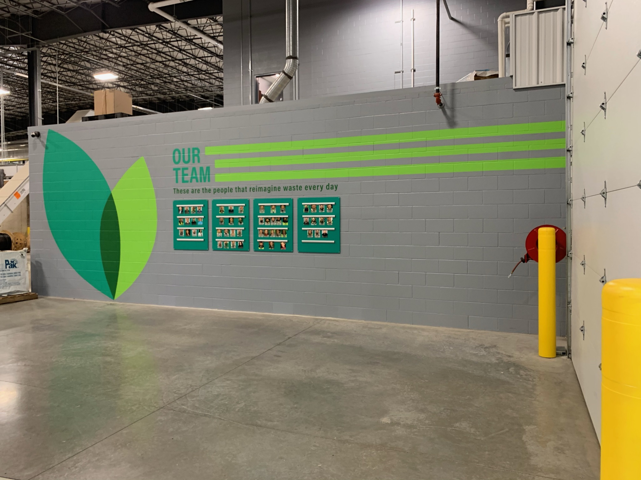
As an environmental graphic designer, few challenges are as rewarding as designing a wayfinding system that truly works. These systems do more than point people from A to B—they reduce stress, reinforce branding, and subtly enhance the identity of a place. A well-planned wayfinding program is built from clarity, consistency, and thoughtful placement of signs and graphics, ensuring visitors feel comfortable and oriented wherever they go.
Great wayfinding requires more than good design—it demands a deep understanding of human behavior, spatial dynamics, and accessibility standards. Whether you’re creating navigation for a hospital, campus, or corporate campus, it’s essential to balance aesthetics with function. We also consider how typography, color coding, icons, and material choices can reinforce visual consistency across all touchpoints.
To ensure long-term success, wayfinding systems must be adaptable. As facilities grow or change, the signage system should be able to evolve without requiring a full redesign. This flexibility is one of the key topics emphasized by SEGD (Society for Experiential Graphic Design), and one we bring to every wayfinding project.
1. Bold Floor‑and‑Wall Graphics in Corridors A numbered directional system created on walls and floors offers intuitive guidance—strong visual cues tied to spatial zones. Implements clear hierarchy and consistency in placement.
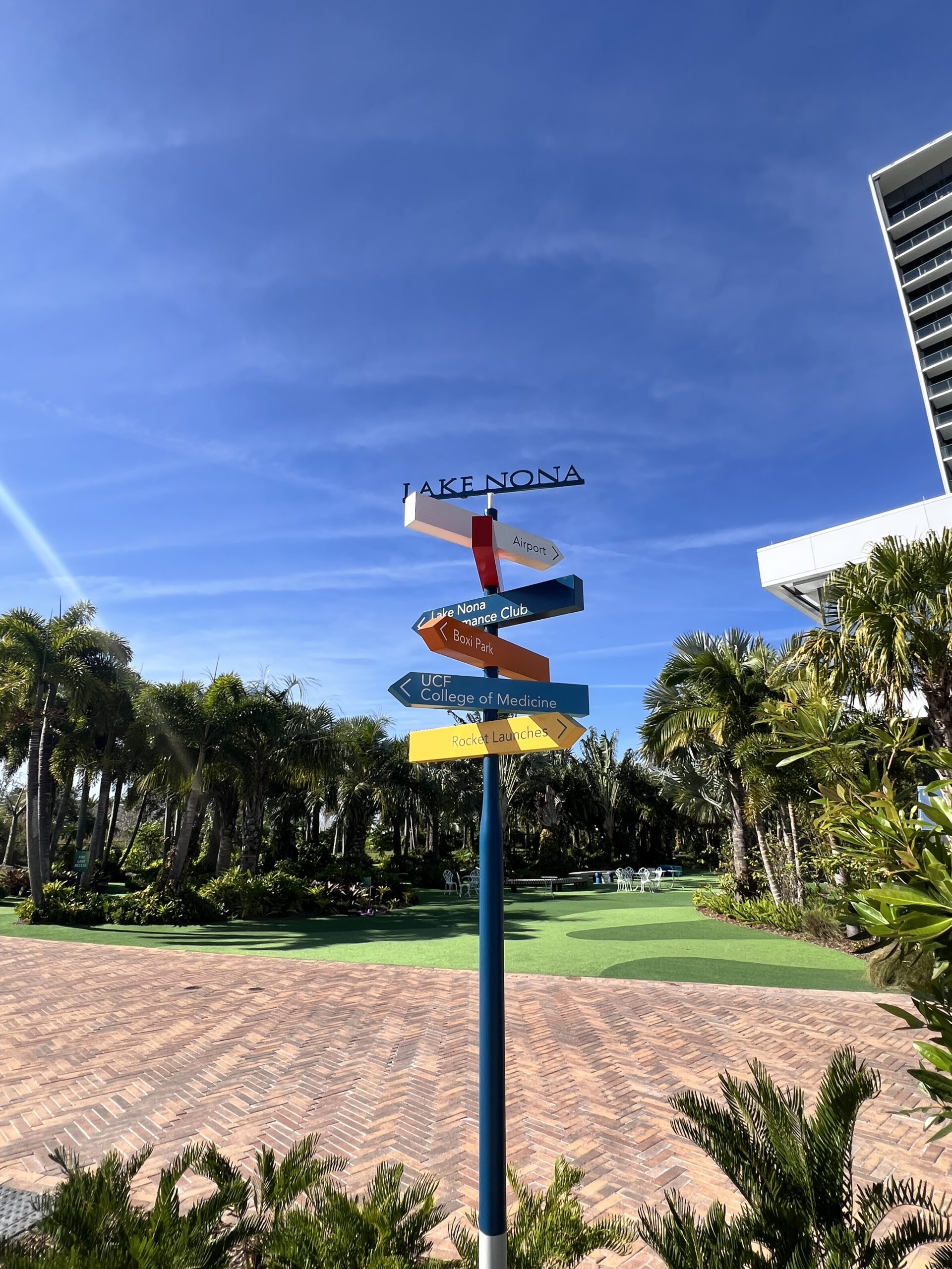
2. Color‑Coded Poles & Fingerposts
Multi-colored arrow posts show different zones or destinations at intersections—highlighting how color and contrast aid quick orientation, and how hierarchical cues guide users .
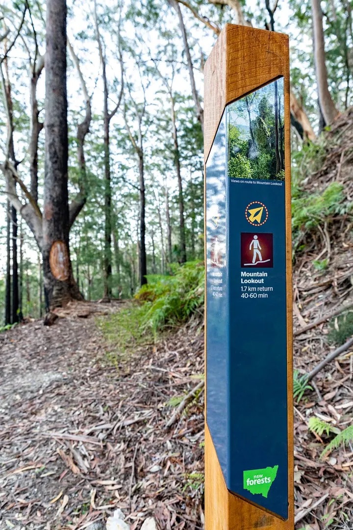
3. Outdoor Community Path Signage
In parks or campuses, freestanding posts indicate distances, amenities, or safety info (e.g. “rattlesnake warning”). Aesthetically integrated yet adaptable to changing layouts .
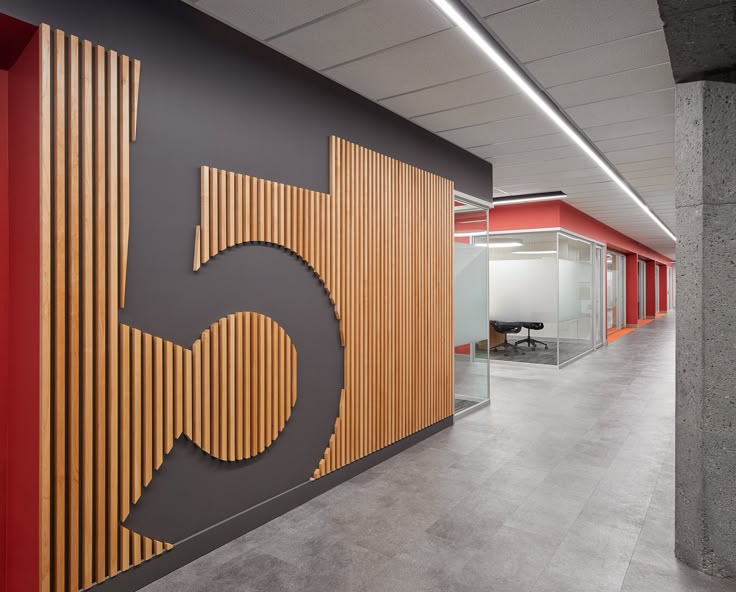
4. Functional & Branded Interior Wayfinding
Industrial or corporate interiors use wall-mounted icons, room IDs, and directional arrows with clear typography—showcasing accessibility compliance, readability, and successful branding integration
6 Principles of Effective Wayfinding Systems 🎯
Clear Hierarchy & Organization
Different sign types—informational maps, directional arrows, and destination IDs—help shape a logical flow.
Legibility & Accessibility
Use of sans-serif fonts, high contrast (70% LRV), Braille, tactile elements ensures universal readability and compliance.
Consistent Visual Language
Unified colors, typography, iconography that reflect your brand fosters familiarity and trust.
Strategic Placement at Decision Points
Signs installed at junctions, stairs, intersections—minimizing clues overload while maximizing clarity.
Color Coding & Symbol Systems
Use of distinct color zones or pictograms lets users navigate by intuitive visual logic, beyond language limitations.
Adaptability & Modular Design
A system designed for future expansion—using modular units or digital updates—keeps spaces navigable even when layouts shift.
Certainty, Variety & Delight: The Three Pillars of EGD
In Environmental Graphic Design, emotion isn’t an afterthought—it’s the engine. Spaces aren’t just seen or used—they’re experienced as stories in motion. Each element—from material and typeface to sightline and scale—is a narrative choice. The three emotional pillars of certainty, variety, and delight form the framework that makes these stories feel alive.
🧭 Certainty – The Opening Scene Certainty is your story’s set — the establishing shot that visually anchors the user. Through clear wayfinding, consistent iconography, sightline clarity, and visual cues, we eliminate confusion and foster confidence. Just like a strong opening scene in Star Wars the spark of I am here on Tattoine certainty says: you’re in the right place, and you’re safe to continue.
🎨 Variety – The Plot Twist Variety is where the story keeps its grip. In EGD, variety does the same through scale shifts, bold materials, texture plays, and color sparks. It transforms the user from passive traveler to curious explorer. Each new sensory beat acts like the next episode—you can’t wait to see what comes next.
✨ Delight – The Emotional Payoff Delight is the big emotional beat—the plot twist that makes you feel. It might be the sparkle of light on a custom mural, an engraved quote revealing itself on a bench, or an interactive feature that encourages a smile. These are purposeful moments that create emotional resonance and cultivate memory. Travis builds experiences where guests “feel slightly uncomfortable—in the best way possible” , inviting them into a story that transcends the ordinary.
🎬 Story-Driven Places When certainty, variety, and delight are choreographed like acts in a story, EGD becomes immersive narrative. Users don’t just traverse space—they live through a designed script. They’re grounded, then intrigued, and finally emotionally moved. Travis Chambers’ Outpost X model is proof: “a really good storyteller on-site shooting only on iPhone in reels format… hooks you into characters and story”. The same narrative techniques are at play in successful EGD.
By weaving these three pillars with storytelling intent, designs do more than convey information—they connect. They turn visits into experiences, signs into scenes, and buildings into storybooks.
EGD doesn’t just direct—it transforms.
Here’s a detailed comparison of an experience at Star Wars: Galaxy’s Edge at Disneyland or Disney World) and Meow Wolf Denver (Convergence Station) — both immersive environments, but with very different approaches to storytelling, design, and emotional engagement:
🎥 Star Wars: Galaxy’s Edge
An immersive cinematic environment built on franchise mythology
1. Story Format:
Galaxy’s drops you inside a story world you already know — the Star Wars universe. It’s a linear, branded narrative. You’re a visitor to the Black Spire Outpost on Batuu, caught in the tension between the Resistance and the First Order. You don’t create the story—you step into a pre-written scene.
2. Emotional Arc:
Certainty: High — Disney is masterful at using signage, costuming, lighting, and spatial design to orient you without breaking the story.
Variety: Balanced — Changes in texture, material, and layout simulate a bustling marketplace, rebel hideouts, or galactic hangars.
Delight: Intense — From building your own lightsaber to flying the Millennium Falcon, the emotional highs are designed to deliver awe and nostalgia.
3. Design Language:
Hyper-detailed, realistic, cinematic
Texture-rich and weathered, evoking sci-fi frontier worlds
Soundscapes, cast interactions, and ambient storytelling immerse you in a believable film set.
4. Role of the Visitor:
You’re a participant, but within scripted bounds. You cosplay, you barter, but you’re part of their world, not creating your own.
🎨 Meow Wolf Denver (Convergence Station)
An immersive, multidimensional art installation built around speculative fiction
1. Story Format:
Convergence Station is a non-linear, co-created narrative. You explore fractured realms (like the neon-bright C Street or cathedral-like Numina) in a story about memory, loss, and identity across parallel worlds. It’s abstract, fragmented, and meant to be discovered—not explained.
2. Emotional Arc:
Certainty: Low — That’s the point. You’re often disoriented, encouraged to explore without a map or clear goal.
Variety: Extreme — Every room shifts your perception: from sci-fi to surreal to organic. Unexpected scale and interactive objects fuel curiosity.
Delight: Spontaneous — Delight here comes from discovery: a hidden door, a musical wall, or an actor whispering a clue. It’s designed to evoke wonder and mystery.
3. Design Language:
Maximalist, layered, often psychedelic
Combines analog, digital, sculptural, and interactive art
Dense, surreal environments challenge the senses
4. Role of the Visitor:
You are a detective, explorer, and co-creator. Your path is your own. You might even find pieces of narrative others miss entirely.
🧠 Comparison Summary:
Element
Outpost X (Galaxy’s Edge)
Meow Wolf Denver (Convergence Station)
Story Control
Pre-written, branded
Open-ended, co-created
Design Feel
Cinematic, controlled
Artistic, chaotic
Navigation
Easy, linear
Disorienting, exploratory
Emotional Tone
Epic, nostalgic
Surreal, thought-provoking
Audience Role
Participant in a film
Explorer of a multiverse
🧩 Final Thought:
Outpost X offers the perfect story you already know, polished to cinematic perfection.
Meow Wolf offers a story you have to uncover, layered in symbolism, memory, and sensory tension.
Both are unforgettable. But if Outpost X is Star Wars as theme park opera, Meow Wolf is a lucid dream in 4D.
Steve Jobs perceives things differently. Vision is not the same as perception; perception separates the innovator from the imitator.
The key to thinking differently is to perceive things differently, through the lenses of a trailblazer.
When the brain is confronted by the same visual stimulus repeatedly the neural responses are reduced…
In order for our imaginations to operate at peak levels those neurons have to fire at maximum output. Bombard the brain with new experiences.
Leonardo had 3 principal traits in common: insatiable curiosity, a desire to challenge the status quo, and the knowledge, that creative inspiration comes from seeking out new experiences.
Creativity is connecting things
Don’t let the noise of others’ opinions drown out your inner voice.”
The signature of artists is not in what they do but in how intense their motivation is to manifest the extraordinary.
Because art is the act of navigating without a map.. S Godin
The key to thinking differently is to perceive things differently, through the lenses of a trailblazer.
Jobs perceives things differently. Vision is not the same as perception; perception separates the innovator from the imitator.
The key to thinking differently is to perceive things differently, through the lenses of a trailblazer.
When brain is confronted by the same visual stimulus repeatedly the neural responses are reduced…
In order for our imaginations to operate at peak levels those neurons have to fire at maximum output. Bombard the brain with new experiences.
Leonardo had 3 principal traits in common: insatiable curiosity, a desire to challenge the status quo, and the knowledge, that creative inspiration comes from seeking out new experiences.
Creativity is connecting things
Don’t let the noise of others’ opinions drown out your inner voice.”
The signature of artists is not in what they do but in how intense their motivation is to manifest the extraordinary.
Because art is the act of navigating without a map.. S Godin
You might be thinking, “My business doesn’t need a website. I have a Facebook page.” While that may be true, it’s also missing the point. A website is way more than just an online brochure—it’s an important part of your overall marketing strategy that shouldn’t be overlooked. A good website design can boost your search engine rankings and increase brand awareness, while also making it easier for people to find information on your products or services. The best website designs are built with responsive design, which means they look great on any device (phone, tablet, desktop) and make sure visitors can easily navigate around your site by organizing information into logical sections rather than just dumping everything into one big list (like this article). In short: if you’re not taking full advantage of this powerful tool for reaching potential customers then you’re missing out!
In today’s over-saturated digital world, is your website design doing more harm than good for your business?
These days, a website isn’t just a brochure; it’s the place where your business can connect with your customers.
Your visitors want to find their way around your site easily and quickly so they can get what they came for and move on with their lives. They don’t want to spend time fumbling through pages that look like they were made by someone who has no idea what they’re doing and no interest in making things better.
The best thing you can do for yourself is hire someone who understands what makes websites work well (and doesn’t just think that text boxes are an appropriate replacement for buttons).
Do you have a unique look that separates you from the competition?
Do you have a unique look that separates you from the competition?
Your website is your digital storefront and it needs to be memorable. In fact, most people will only read up to the first paragraph of your product descriptions on Amazon or other eCommerce sites, so having a sleek and professional design can help boost sales. The best way to achieve this is by using an eye-catching design that makes people want to stick around for more than just a glance. Here are some ways you can stand out from the crowd:
Unique color scheme and logo – Your brand’s colors should be consistent across all platforms, including social media profiles, business cards and websites (including mobile). This helps build recognition for your brand in consumers’ minds.
Are you using the latest technology and marketing tools?
Keeping up with the latest technology is important. The tools that you use to create and maintain your website are constantly changing, so you need to make sure that your business website is using the latest technology.
Along with keeping up with new tools, it’s also important to stay on top of search engine algorithms. You may be using all of the best marketing strategies out there, but if Google or Bing thinks that your site isn’t relevant for certain keywords or phrases (or even worse — if they think that your site might be harmful), they can penalize it by placing it lower in their ranking system than websites who have not been penalized at all!
Do your visitors find it easy to navigate your site and find the information they seek?
Navigating a website is the first step in providing value to visitors. If a user can’t find the information they’re looking for, they will leave your site and never come back.
To make sure that your navigation provides value and is easy for users to use:
Be intuitive. Your navigation should be easily found and understood by anyone who uses it, whether they are familiar with your website or not. Make sure that the labels on each link make sense (no pun intended).
Keep it consistent across pages if possible so people know where things are when they come back later; otherwise, create an internal link structure so users know how to get around without needing instructions every time they visit a page on your site that doesn’t have an obvious navigation bar at top or bottom of page (such as blogs).
Make sure links are fast and responsive when clicked so there aren’t any delays between rolling over them or clicking them and having content appear where you want it too–especially important if this happens frequently throughout different parts of site because users might start getting frustrated having waited several seconds between each action taken while trying out different parts?!”
Your website is much more than an online brochure. It’s a powerful tool that needs to work as hard as you do.
Your website is much more than an online brochure. It’s a powerful tool that needs to work as hard as you do.
Your website is the first thing people will see when they search for your business online—it’s the first impression they’ll get of your business and what it has to offer. A well-designed website can set you apart from competitors by making it easy for visitors to find what they’re looking for quickly and easily, making them more likely to make a purchase from you instead of somewhere else.
Your website should also be designed with SEO in mind (search engine optimization). This means having relevant keywords in text on the page, including an image alt tag (a relevant image description) and meta description tags on each page so Google knows what each page is about when it crawls through its index every day looking at new sites submitted by web developers around the world!
Conclusion
We hope this article has helped to dispel some of the myths surrounding website design and its importance
Hi Octane Design Receives 2021 Best of Oceanside Award
Oceanside Award Program Honors the Achievement
OCEANSIDE March 11, 2021 — Hi Octane Design has been selected for the 2021 Best of Oceanside Award in the Website Designer category by the Oceanside Award Program.
Each year, the Oceanside Award Program identifies companies that we believe have achieved exceptional marketing success in their local community and business category. These are local companies that enhance the positive image of small business through service to their customers and our community. These exceptional companies help make the Oceanside area a great place to live, work and play.
Various sources of information were gathered and analyzed to choose the winners in each category. The 2021 Oceanside Award Program focuses on quality, not quantity. Winners are determined based on the information gathered both internally by the Oceanside Award Program and data provided by third parties.
About Oceanside Award Program
The Oceanside Award Program is an annual awards program honoring the achievements and accomplishments of local businesses throughout the Oceanside area. Recognition is given to those companies that have shown the ability to use their best practices and implemented programs to generate competitive advantages and long-term value.
The Oceanside Award Program was established to recognize the best of local businesses in our community. Our organization works exclusively with local business owners, trade groups, professional associations and other business advertising and marketing groups. Our mission is to recognize the small business community’s contributions to the U.S. economy.
SOURCE: Oceanside Award Program
CONTACT: Oceanside Award Program Email: PublicRelations@2021management-best-notice.net URL: http://www.2021management-best-notice.net