Understanding Architectural Signage: Bridging Environmental and Experiential Design
Understanding Architectural Signage: Bridging Environmental and Experiential Design
Architectural signage is more than a label—it’s the handshake between space and story. Whether guiding, identifying, or inspiring, signage plays a critical role in shaping how people experience a place. When executed with intention, architectural signage aligns with the architecture, interiors, and landscape. It’s a cornerstone of Environmental Graphic Design (EGD), and a key element in creating truly immersive Experiential Design.
The Role of Architectural Signage Signage isn’t just functional—it’s emotional, directional, and often the first point of brand engagement. It plays three core roles:
Identification – Naming a business, building, or room to anchor recognition. Wayfinding – Helping visitors confidently navigate through space. Information – Conveying vital content like hours, rules, or instructions. Done right, signage reflects the soul of a space, extending the architecture’s intent into every visitor’s interaction.
Types of Architectural Signage Each type of signage serves a specific purpose—together, they create a cohesive and navigable environment. 1. Exterior Identification These signs introduce the building or brand from the outside—monument signs, dimensional letters, blade signs, or logo panels. They often use durable materials and integrate with the structure’s architecture. 2. Wayfinding Systems A coordinated set of directional signage elements that help visitors navigate complex environments like hospitals, campuses, or airports. These systems prioritize clarity, consistency, and ADA compliance. 3. Informational & Regulatory These signs provide essential messages—office hours, accessibility info, safety guidelines—often designed to be clear but still on-brand. 4. Donor Recognition & Storytelling Displays Used to honor contributors or convey history, these signs are often sculptural or integrated into interior walls, creating moments of engagement through storytelling or digital interaction. 5. Digital and Interactive Signage LED panels, touchscreens, and real-time updates that deliver dynamic content like maps, events, or brand narratives—blending utility with experience.
From Environmental to Experiential Design Environmental Graphic Design connects people to place using typography, color, form, and materials. But in modern design practice, we’re stepping beyond the environment alone—we’re designing experiences. Signage becomes a narrative layer—evoking a mood, directing behavior, and building brand emotion. It can: Use texture, light, and interactivity to make spaces memorable Extend a brand’s visual language into the built world Foster an emotional connection between visitor and place Experiential signage isn’t just about getting from A to B. It’s about creating a journey with meaning at every step.
The Power of Collaboration Signage is most successful when it’s considered early in the design process. Collaborating with architects, interior designers, fabricators, and brand strategists ensures the signage feels native to the space—not an afterthought. It’s a design discipline that unites graphics, storytelling, materials, and behavior—transforming space into experience.
Environmental Graphic Design (EGD) is more than placing signs or adding color to a space—it’s about shaping human experience. As experts in EGD, we start with empathy. Who are the users or guests? What do they feel when they enter a space? We explore these emotional questions first to guide design decisions that make a real impact.
Every project begins with deep research and observation—understanding how people flow through space, how they interact with surroundings, and what stories they subconsciously absorb. This human-centered design process ensures that our EGD not only functions but also forges meaningful emotional connections.
Whether guiding someone through a multi-family building, university, or mixed-use space, successful EGD makes the experience intuitive and delightful. It quietly builds trust and comfort by serving human needs with clarity and emotional resonance.
International Symbol Signs: A Universal Communication Tool
Symbol signs are a system of 50 pictograms designed to communicate information to passengers and pedestrians in airports, transportation hubs, and other large international venues. They were developed by the American Institute of Graphic Arts (AIGA) in collaboration with the U.S. Department of Transportation (DOT) in the 1970s.
International Symbol signs are designed to be universally understood, regardless of language or culture. They use simple, geometric shapes and clear colors to convey information about essential services and facilities, such as restrooms, baggage claim, and emergency exits.
The symbols are also designed to be highly visible and legible from a distance. They are often used on signs and maps in airports and other busy transportation facilities, where people are often moving quickly and may not have time to read text.
Symbol signs have become a standard feature of transportation facilities around the world. They are also used in other public places, such as museums, stadiums, and shopping malls.
Benefits ofsymbol signs:
Universal communication: symbol signs can be understood by people of all languages and cultures.
Clear and concise: The symbols are simple and easy to understand, even from a distance.
Highly visible: The bright colors and bold shapes of the symbols make them easy to see in busy environments.
Versatile: symbol signs can be used to convey a wide range of information, from essential services to directional cues.
How to use International symbol signs:
When using symbol signs, it is important to consider the following guidelines:
Use the symbols in a consistent way throughout your signage system.
Place the symbols in a prominent location where they can easily be seen by pedestrians and travelers.
Use clear and concise text to supplement the symbols, but avoid cluttering the signs.
Make sure the symbols are large enough to be legible from a distance.
Conclusion
Pictograms or symbol signs are a valuable tool for communicating information to people from all walks of life. By using these symbols in a clear and consistent way, you can help to create a more welcoming and accessible environment for everyone.
But when exactly was it that we started using words, symbols, and patterns to create an environment? The short answer: from the start.
Graphics have always been an inherent part of architecture, making the language of patterns, words, signage, and narratives as much of a part of the community as the buildings themselves. Almost every documented culture used words, symbols, or patterns in their environments—and we’re still doing it today, taking old techniques to new levels.
Taking a look back, as we create environments for the future, is fascinating and inspiring, which is why we are publishing a series of articles that take an in-depth look at the relationship of graphics and architecture. First, we’re starting with the origins, exploring how typography, patterns, and culture have helped create the architectural identity of buildings for centuries.
Graphic Design Connections to Architecture
IN THE BEGINNING
For centuries, architecture and graphic design have coexisted in the built environment, although each discipline has its own unique language. If you combine and meld them, they create a whole new vocabulary that can give a building its unique identity.
ANCIENT EGYPT
Let’s go all the way back to hieroglyphics in ancient Egypt. Hieroglyphics used graphic, syllabic, and alphabetic elements to create characters and tell stories. However, these did not just act as storytelling—they also gave structures cultural identities that are still being studied today.
While the centuries, uses, and structures have changed, we’re still seeing the same relationship between graphics and architecture. Classical inscriptions, figurative murals, and ornamental surfaces have all evolved over time to reflect the social and cultural climate of each changing era, becoming part of our visual heritage.
ARCH OF TITUS
Over the decades, these depictions evolved to reflect the social and cultural climate of each changing era, becoming part of our visual heritage. You can take a walk through any city and see graphic elements in architecture almost everywhere. Think of a city hall, or maybe your town’s library. While your city hall may not have the intricate carvings like the ones seen on the Arch of Titus in Rome, it may have similar carved inscriptions letting you know that it is a city hall.
Arch of Titus, Rome 100 AD. Credit: Getty Images
The Arch of Titus itself is an example of graphics evolving to reflect changing times. It was restored in 1821, and the restorations included new carvings to reflect the current religious landscape, which were made in travertine limestone to differentiate between the old and the new.
What’s changed as times changed?
NOTHING AND EVERYTHING
Through all of the world’s political, religious, and industrial revolutions, the use of architectural graphics hasn’t just continued—it has flourished and grown into a critical component of how society engages with architecture. Today, we are still using graphics in architecture to convey language and meaning through both two- and three-dimensional design. Architectural graphics woven into the environment solidify narratives, culture, and history, and build a sense of community.
1939 WORLD’S FAIR
1939 World’s Fair. Credit: Getty Images
The combination of graphics and architecture is what most inspired environmental graphic design pioneer Deborah Sussman. Sussman vividly recalls her memory of the 1939 New York World’s Fair installation:
“The famous ‘Trylon and Perisphere’ of the 1939 New York World’s Fair became another lasting icon for me. In this case, it was the form and its whiteness, its newness, its bigness, and its simplicity that lives in memory. It wasn’t architecture; it wasn’t really sculpture, and certainly not graphic design. So what was it? It did not fit into a category neatly. Could it have been ‘environmental graphic design’?”
– Deborah Sussman
Sussman helped to define what structures did not fit into a category, but still made a powerful impression. Now, the famous Trylon and Perisphere lives on in memory as the origin of modern environmental graphic design.
The Power of Typography and 2D Patterns
GRAPHIC ARCHITECTURE
The graphic design of typography, imagery, symbology, and art can tell cultural and visual stories, and oftentimes echo an architectural and cultural message.
The human desire to “dedicate” places is clearly the reason graphics were integrated into the built environment. Inscriptions, figurative murals, and ornamental surfaces have long been a part of architecture. These elements and concepts transformed over time, reflecting the social, political, and cultural climate of each period and becoming part of our rich visual and cultural heritage.
Mussolini’s Palazzo Braschi, Rome. Credit: History Today; New York Times Building. Credit: Wikimedia Commons
TYPOGRAPHY AS A TOOL
The typography we see today, along with layered two-dimensional patterns, have been used to define a structure’s identity for centuries.
Typography is a particularly powerful tool. Compare The New York Times building in New York, the Arch of Titus in Rome, and Mussolini’s Palazzo Braschi in Rome. While the three structures bear little resemblance to each other culturally, politically, or geographically, they all use typography to tell their identity story.
The Arch of Titus is a religious honorific arch, whereas Palazzo Braschi was once the headquarters for Italy’s fascist party. Then you have The New York Times building, which tells you not only that it’s a prominent publication, but also that it is part of the very fabric of New York City.
Environmental Architecture
COMING OF AGE
LAS VEGAS
Las Vegas in the 1940s is a great example of how wayfinding and signage are design elements that can turn buildings into landmarks. Sure, the bright lights and typography gave you information and told you where to go—but they also helped to give Las Vegas its cultural identity.
Las Vegas in the 1940s
SANTA MONICA PLACE
Architects of the 1980s embraced using typography to solidify architecture brand identity. Take Frank Gehry’s Santa Monica Place in Los Angeles, for example. He used gigantic typography layered with chainlink to turn something that could have been ordinary into an iconic image that has been woven into the pop culture history of Los Angeles.
Santa Monica Place. Credit: Friends of San Diego Architecture
SEATTLE ART MUSEUM
Go a little farther up north to Washington, and you can see another excellent example of typography in architecture. The Seattle Art Museum, designed by Robert Venturi and Denise Scott Brown, uses typography in a way that seems so simple, but has such an impact. That “simple” typography has made the museum truly stand out in a city full of iconic buildings.
Seattle Art Museum
UNIVERSAL CITYWALK HOLLYWOOD
If you jump to the 1990s, Jon Jerde’s design for Universal CityWalk in Los Angeles also shows how signage isn’t just a simple addition to the architecture, or something that gets in the way of it—it is a crucial part of the design.
The engaging aspect about examples of architectural graphics is that they’re everywhere, in almost every city or town. Even now, we’re seeing some of the most exciting examples of architectural graphics yet—which is what we’ll talk about in our next blog post.
Universal CityWalk Hollywood
GRAPHIC DESIGN CONTINUES TO TRANSFORM ARCHITECTURE
Many aspects of the built environment—including urban streetscapes, office buildings, museums, airports, public parks, mixed-use developments, and entertainment centers—have been transformed by the integration of graphic design and architecture.
Although the discipline of architectural graphics was only recognized relatively recently, it has long been known not only for its functional improvements, but also for its integral relationship to changes in architecture, cultural movements, and art. This combination of the disciplines can shape our overall perception and memory of place and ultimately enrich our experiences with the built environment.
The conversations surrounding graphics in architecture are important. Graphic typography and texture can enhance architectural design in so many ways, and even turn a building into an iconic destination.
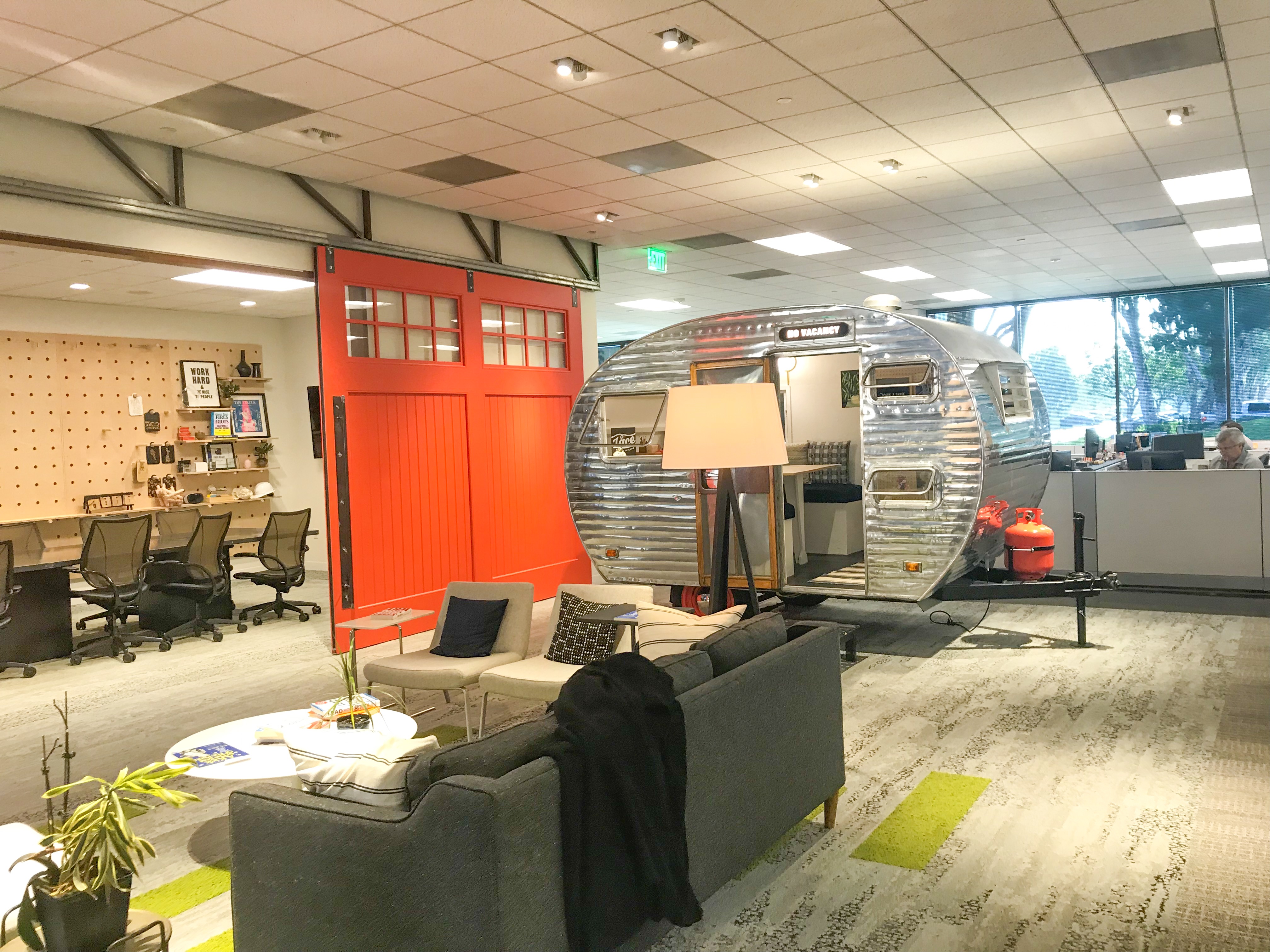
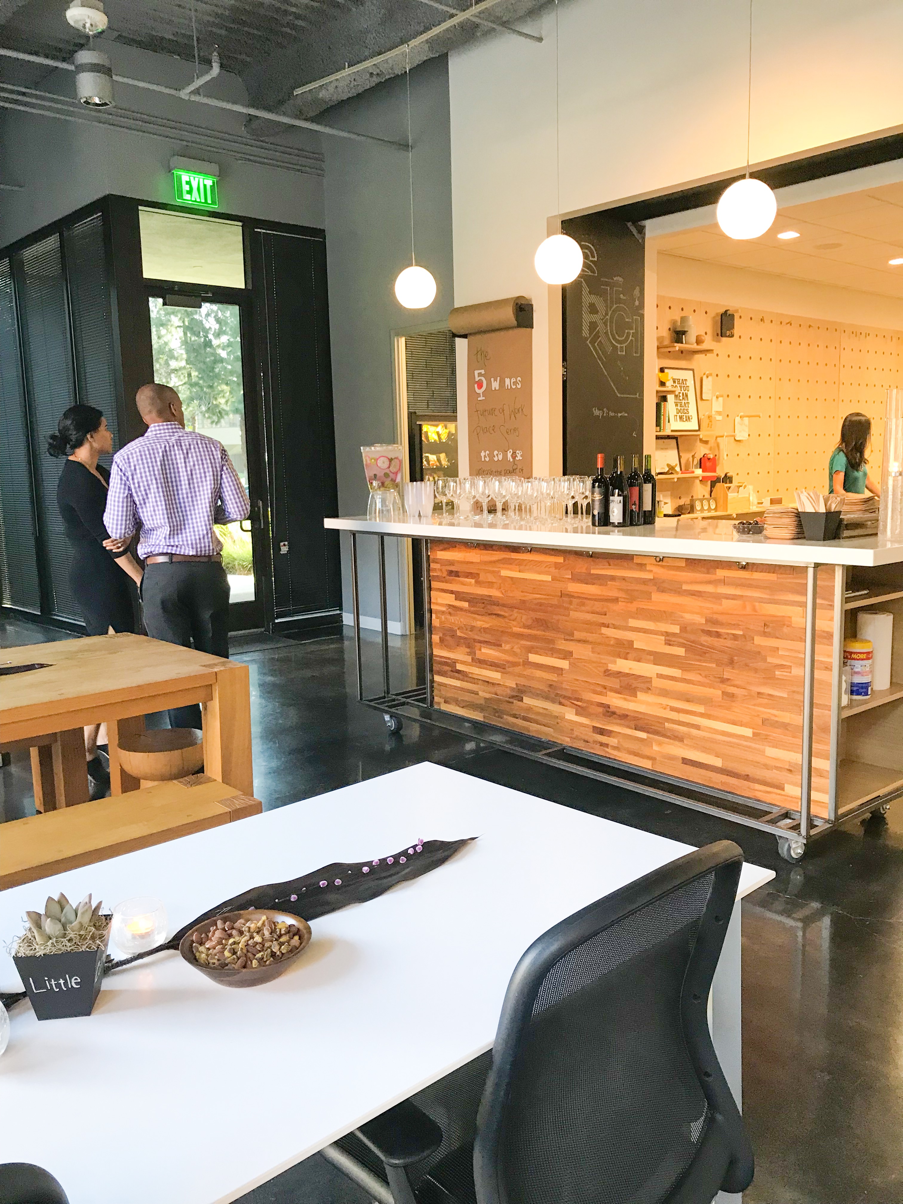
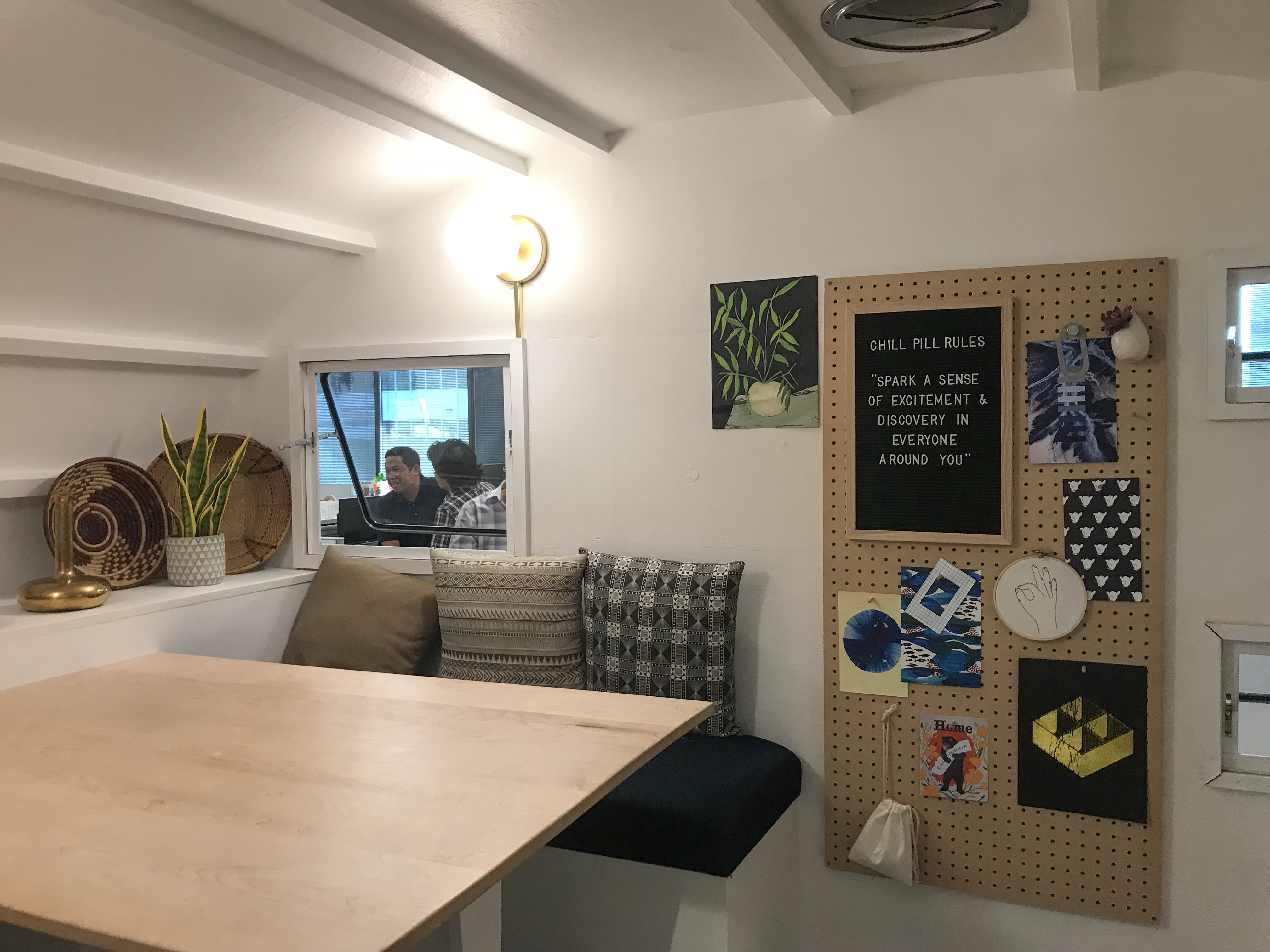
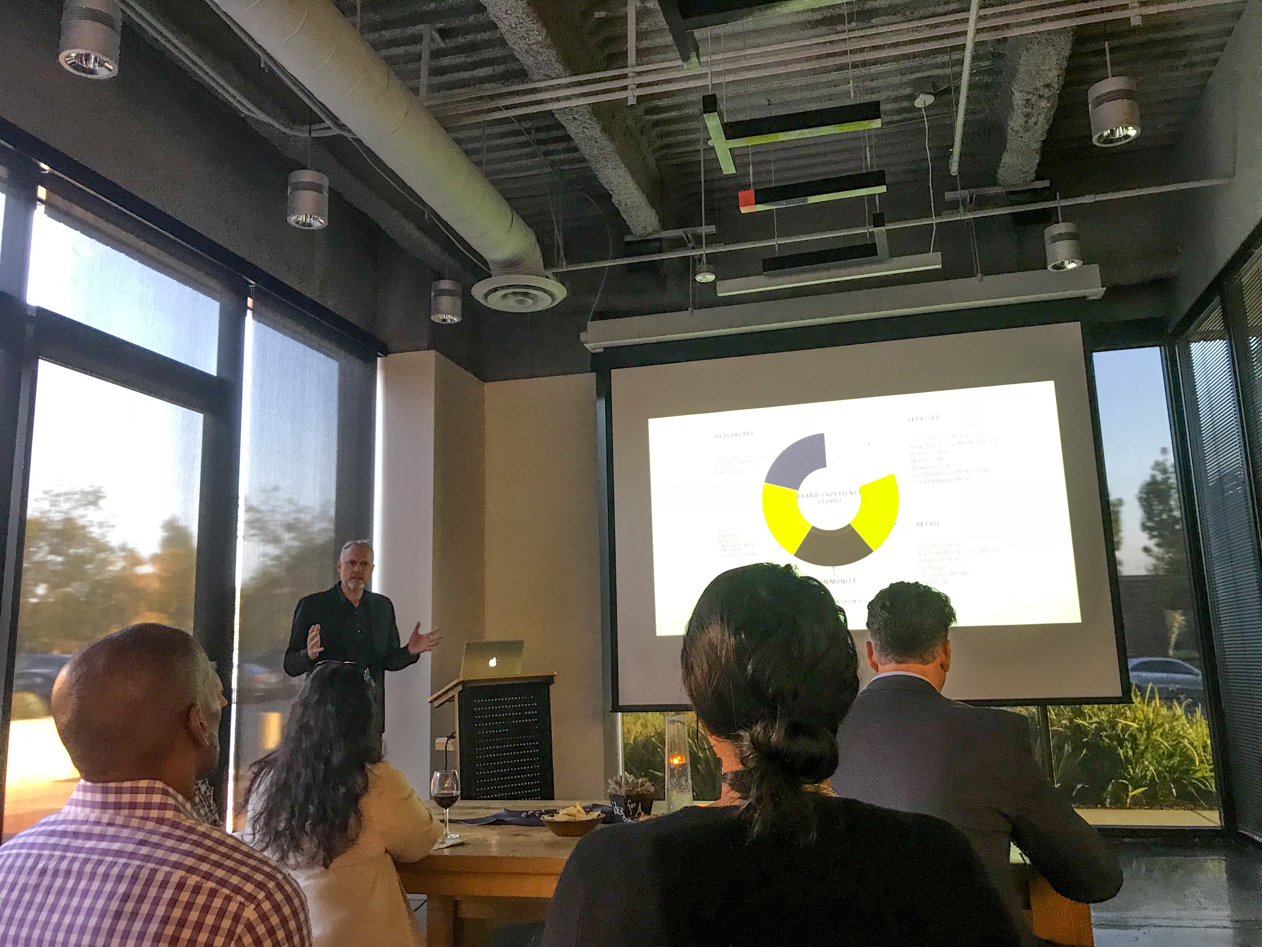
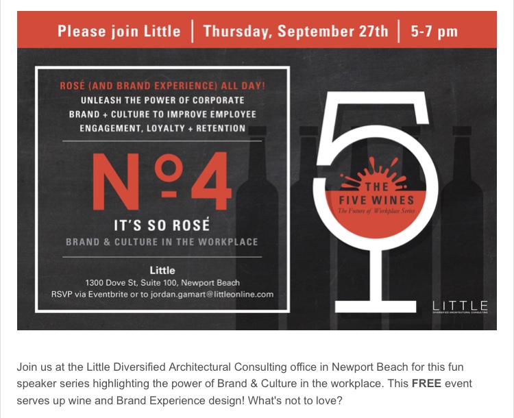
Enjoyed getting out this evening to an event put on by Little Architecture in Newport Beach, CA. They have a great workspace which you can see here in the photos below. Their main conference room is Garage Themed “Because many great companies start in garages.” Their’s features a cool “peg board” wall and orange barn door sliding garage doors. They also have a fabulous canned ham trailer which is a smaller meeting room. Their team gave a nice talk on Branding | Culture | Storytelling – Touching on Ideation Differentiation & Connection. They also showed some projects they have worked on like Shinola, Credo and Adventist Health. Adventist Health was a bit serendipitous for me because I had been designing logos for a 7th Day Adventist School the day prior. I also love the quote they ended the presentation on by their founder Bill Little ” People remember what they never expected.” That is so true I remembered all the elements I wasn’t expecting there.